Search This Blog

Thursday, December 13, 2012

Acer C7 Chromebook review


You might have thought it impossible to make a cheaper Chromebook than the Samsung Chromebook Series 3, but you’d be wrong. With the new C7 Chromebook, Acer has constructed a slim-and-light laptop running Chrome OS that can be sold for a ludicrously low £199.
What’s more, it’s constructed one that in some ways outmatches the Samsung. It has a clearer, brighter and higher-contrast 11.6in screen, a more notebook-like 1.1GHz Intel Celeron 847 processor instead of the Samsung’s ARM-based Exynos 5 CPU, and more onboard storage. It even has, on the whole, better connectivity. Why then, would we prefer the Samsung of the two?

Physical design

Partly, it comes down to look and feel. With its Chromebook, Samsung came up with what was effectively a bargain-basement Ultrabook; lightweight and a little cheap and plasticky, but reasonably robust and very practical. The Acer has a smaller desktop footprint at 285 x 202mm against the Samsung’s 290 x 204mm, but it’s thicker at 25mm to the Samsung’s slimline 17.5mm, and also heavier at 1.4kg to the Samsung’s 1.1kg. The result is a machine that feels closer to a netbook than an Ultrabook, albeit a larger than average one with a screen and keyboard to match. It also feels creakier in places than the Samsung, with more bounce under the keyboard and more flex in the chassis underneath. With its two-tone black and grey-metallic casing the C7 looks smart, but like the Samsung, it feels cheaper than it looks. I’d still happily throw one in a backpack, but I’d be happier carrying the Samsung day-to-day.
There’s also the lesser question of noise. One of the good things about the new Samsung Chromebook is that, thanks to the kind of ARM-based processor normally found in tablets and smartphones it runs completely silent. With its more conventional Intel processor, the C7 doesn’t, and you’ll hear the fans kicking in quite a bit as soon as the CPU has a little work to do. It’s a surprisingly irritating buzz, and not helped by the fact that while the Samsung uses solid-state storage, the C7 uses a standard laptop hard disk. As a result, you’ll hear that clicking away from time to time.

Connectivity

Connectivity is one area where the C7 improves on the Samsung Chromebook Series 3. It might not have the Samsung’s USB 3.0 port, but makes up for it with three USB 2.0 ports to the Samsung’s one, plus HDMI, VGA and headphone outputs.
There’s also an SD memory card slot at the front and an Ethernet port on the left-hand side; one thing which the WiFi-only Samsung couldn’t boast. USB 3.0 is still most useful for connecting external storage, so on a device designed to work with cloud-based services its omission isn’t a fatal flaw. Overall, the C7 provides a better balance of ports and sockets.

Ergonomics

Unfortunately, the C7’s smaller desktop footprint comes at a cost. Where the Samsung Chromebook has a relatively luxurious keyboard with generously sized keys, not to mention a surprisingly big touchpad, the Acer has to manage with only slightly smaller keys, but a more cramped layout. The Chrome OS-specific function keys in the top row are tiny, while the cursor keys are ridiculously minute. The hash key is actually jammed against the return key, and ditto for the backslash key and the left-shift.
However, It’s not all bad news. The trackpad might be smaller, but it feels marginally more responsive than the one on the Samsung, particularly when it comes to two-finger gestures for scrolling or right-clicking. Meanwhile what’s become a Power button on Samsung’s Chromebooks, here returns to its original role: Delete. While I prefer the crisper typing action on the Samsung, I wouldn’t call the C7’s keyboard a disaster by any means. In fact, I’m using it to write this review right now, and barely missing a keystroke.

Screen and sound

The screen on the C7 is better than the screen on the Samsung Chromebook. It’s brighter, there’s more contrast, and whites look genuinely white and not slightly yellow. While it’s a TN screen with all the narrow viewing angles that implies, it still beats most netbook screens and even many budget laptops stone dead. The 11.6in size and 1,366 x 768 resolution match the Samsung, and the only advantage the latter is left with is that the matt surface will fare better in more lighting conditions than the Acer’s glossy coating.
When you’re looking at photos or watching video, the C7 delivers stronger pictures and better colours every time. When it comes to sound, the C7 is a little less impressive. It’s hard to get a beefy output out of a laptop this size, and even harder when you’re doing so on such a tight budget. The Acer’s audio is weak, tinny and lacking bass and clarity. If you want to stream music or watch a film you’d better plug some headphones in.

Software

Having only just covered Chrome OS in the Samsung review, we won’t go overboard on it here. The important thing is that Google’s cloud-based OS is now ready for primetime. It has apps to cover most needs and scenarios, it supports a more conventional Windows-like UI with multiple windows, and the old complaint that a Chromebook is useless without an Internet connection no longer holds water. You can work on documents, spreadsheets and presentations offline and sync changes when you next connect, and you can also read and answer emails. The built-in file handlers for video, photos and PDFs offer more features and are easier to use, and file management as a whole is no longer a disaster.
I still wouldn’t want to use a Chromebook to do heavy-duty photo or video-editing, or even use one as my main PC, but as a cheap, highly mobile, secondary computer it’s perfectly adequate for everyday use. There’s zero maintenance, and it doesn’t waste your time. What’s more, the way Chrome OS works, with everything tied into your Google account and your desktop and app selection changing to match, makes a Chromebook perfect for sharing with a family, an office or a class. There’s not much of a learning curve when it comes to using it, and the more I use Chrome OS, the more I like it. Understand the limitations of working across an Internet connection - particularly in low-bandwidth situations - and you’ll probably feel the same.

Performance

There’s good news and semi-bad news when it comes to performance. Acer’s decision to go with a 320GB conventional hard disk instead of an SSD probably makes sense from an economic standpoint - the C7 is clearly a re-purposed Windows laptop - but it means this Chromebook starts up slightly slower than the Samsung, taking roughly 19 seconds. This isn’t a massive issue, and the C7 doesn’t feel at all sluggish in everyday use, but it is peculiar. After all, it’s not like the cloud-centric Chrome OS is really built to capitalise on a larger drive.
On the good news front, the Celeron-powered C7 performs slightly better on intensive tasks than the ARM-powered Samsung. Where HD video streams stuttered every few seconds on the Samsung, they run reasonably smoothly on the Acer, and games like Bastion are just about playable. The C7’s SunSpider benchmark score is faster than the Samsung’s, at 523.1 to 758.2, and the WebGL Aquarium demo runs at a smooth 60fps to the Samsung’s 36 to 45fps. If you want to play 3D games then you’re barking up the wrong tree with a Chromebook, but you might want to watch films, and in this respect the Acer has the Samsung beat - though we hope to see software updates improve the performance from the Samsung’s perfectly capable Exynos SoC.

Battery life

Sadly, we’re back in netbook territory when it comes to battery life. Acer and Google claim up to four hours, but that really is best-case scenario. While working with the Chromebook we’ve seen around three and a half hours of mixed use with screen brightness at acceptable, near-maximum levels, and a lot of video will drag that down to the three hour mark. This isn’t a problem if your Chromebook will stay rooted to a table or a desk, but a device like this is built for action anytime, anywhere both in and out of the house. The Samsung Series 5, with a life of around six and a half hours, could handle that role with ease, but here the battery life of the C7 is a real limitation.

Verdict

In a whole lot of ways, the Acer C7 Chromebook is a good ultra low-budget laptop. It has a surprisingly decent screen, a usable keyboard and trackpad and enough performance to run a wide range of applications. It’s streets ahead of any netbook you could purchase at this price (and might make the basis of an interesting Linux laptop). As a Chromebook, however, it’s just not as compelling a prospect as the Samsung Chromebook Series 3. Though it has the edge on screen quality, performance and connectivity, it’s heavier, noisier and not as strong in the keyboard department as the Samsung Chromebook Series 3, while the woeful battery life is a serious flaw. Converting an existing Windows laptop to Chrome OS might keep costs down, but the hard disk affects boot times and battery life while offering no real advantages to compensate. This is Acer’s most tempting Chromebook yet, but if you want Chrome OS then the Samsung is still the one to buy.

Specifications

Manufacturer and Product
Acer C7 Chromebook
Processor
1.1GHz Intel Celeron 847
RAM
2GB
Hard Disk
320GB 5400rpm HDD
Memory Expansion
SD Memory Card
Display
11.6in 1,366 x 768 TFT
Connectors
3x USB 2.0, HDMI, VGA, Gigabit Ethernet, headphone
Front-facing camera
720p
Wi-Fi
802.11b/g/n
Battery
2,500mAh
Size and weight
285 x 202 x 25mm, 1.4kg

Nexus 10 Review


DNP Nexus 10 review

When Google unleashed the Nexus 7 upon us earlier this summer we were caught completely off-guard. A $200 tablet that was legitimately good in every regard? It was unheard of at the time, and even five months later it's still a really nice slate. Now it has a big brother, the Nexus 10, this time coming courtesy of Samsung. At $399 it arrives with less fanfare and a higher price, but it also comes with a very distinctive selling point: a stratospherically high resolution.
This 10.1-inch panel has an eye-watering 2,560 x 1,600 resolution -- the very same as the 13-inch MacBook Pro with Retina display but in a much smaller package. Is Google's second reference tablet the ultimate Android 10-incher at a bargain price, or is it simply another big tablet with a lot of pixels? Your answer awaits after the break.

Nexus 10 review

Hardware


The Nexus 7, with its rubberized back and chunky profile, always felt very good for a budget tablet -- but mostly it just felt very good. The Nexus 10 feels like a completely different beast, which isn't entirely surprising since it's from a different manufacturer. ASUS got the nod to build the first reference tablet from Google, a development process that required a very close partnership with the manufacturer. Now it's Samsung's turn, continuing the tradition of Google spreading the Nexus love around.
The Nexus 7 felt very good for a budget tablet -- but mostly it just felt very good. The Nexus 10 feels like a completely different beast, which isn't entirely surprising since it's from a different manufacturer.
It's a fair partnership, since Samsung has long been the biggest supporter of Android on the tablet front, and of course since Google has long had an affinity for the Galaxy Tab 10.1 -- giving away 5,000 of the things at Google I/O a few years back. We've been wondering when Samsung would release a new stylus-free 10-incher, staying mostly quiet since the underwhelming Galaxy Tab 2 10.1. We're happy to say this one fares better. Mostly better.
It starts with a design that definitely looks like an evolution of the Gal Tab 2 10.1, itself very similar to the controversial Galaxy Tab 10.1N, whose most notable feature was a pair of front-facing speakers. That bit of design language carries on here, grilles embedded into the left and right bezel and extended farther down than before, running through nearly the entire vertical extent of the tablet.

DNP Nexus 10 review

Those speakers are hard to distinguish, though, in what is a sea of very dark materials all blending together into an interestingly rounded shape. Yes, this is still largely a rectangular piece of glass with a mind-boggling number of transistors stuffed in behind it, but the corners have big, lazily rounded profiles. Even the sides are subtly curved, bowing outward to eliminate any straight lines. This makes for a tablet that is incredibly comfortable to hold in any angle or orientation, but it also makes for a tablet that looks even bigger than it is.

It's slightly larger than Galaxy Tab 2 10.1, measuring 10.39 x 6.99 inches across (263.9 x 177.6mm) compared to that tablet's 10.11 x 6.9. But, it's well thinner, just 0.35 inches (8.9mm) vs. 0.38 (9.7mm) for its predecessor. That does make it thicker than the ASUS Transformer Pad Infinity TF700 (which is 0.33 inches thick). Meanwhile, for those keeping score across ecosystems, that makes for a tablet that's slightly taller (0.8 inches), narrower (0.4 inches) and thinner (0.6mm) than the latest generation iPad. It's lighter, too, at just 1.33 pounds (603 grams) compared to 1.44 (632 grams).
That relative lightness is likely due to the difference in materials, a plastic back dominating the flip-side of this device. It's covered with a soft-touch coating that feels unusually tacky, almost to the point of being sticky. It's nowhere near as nice feeling as the spun aluminum on the TF700 and a definite, and unfortunate, change from the dimpled cover on the back of the Nexus 7 that both looks and feels good. Mind you, a trace of that lineage remains here, a rubberized strip across the top of the back that has the same sort of perforated leather pattern -- just with a slightly tighter dispersal.
We wish Google would start mandating such covers to hide garish carrier branding on Android handsets.
That strip is punctuated by the 5-megapixel camera (capable of 1080p recording), which is inset next to its friend the LED flash. If you'd like to see more of these two you can actually remove that plastic strip altogether, which also reveals the tablet's FCC designation and all sorts of other internationally mandated brandings that are, printed here, cunningly and tidily hidden away, leaving the back nearly blemish-free. We wish Google would start mandating such covers to hide garish carrier branding on Android handsets.

DNP Nexus 10 review

On the top edge of the slate you'll find the only two physical controls, a volume rocker and a power/lock button. Travel around the corner to the left and you'll find a micro-USB port and 3.5mm headphone jack. On the bottom there's a six-pot pogo pin connector and, on the right, a very welcomed micro-HDMI port for streaming all your legitimately acquired video content to a bigger display. There is, contrary to our expectations, no way to wirelessly stream that video from this tablet, but more on that later in the review.
On the face of the device, again it's those big, beautiful stereo speakers. Inside the upper bezel of the display is a 1.9-megapixel camera (capable of 720p video recording) and, in the bottom bezel, an RGB notification LED. Your proclivity toward such blinkenlights probably directly correlates to the volume of email you receive, but still we're glad to see one here.
And then, of course, there are the juicy bits on the inside. Powering this slate is a 1.7GHz chip of the A15 Eagle variety. That processor architecture is capable of quad-core duties but this particular processor sits in a dual-core configuration. Sitting next to that is a Mali T604 GPU and 2GB of RAM matched with either 16 or 32GB of storage, depending on whether you paid $399 or $499. Neither is expandable.
Go crazy and Beam yourself in either direction. This tablet won't miss a beat.
There are no cellular models just yet, so WiFi will be your only link to the world. As such this slate is reasonably equipped with dual-band and MIMO and HT40 support over b/g/n. (Sorry, 802.11a hold-outs.) You also have GPS, Bluetooth 4.0 and NFC on both the front and the rear. So c'mon, go crazy and Beam yourself in either direction. This tablet won't miss a beat.

Display and sound

We'll type it again just because it's kind of neat: 2,560 x 1,600. That's an awful, awful lot of pixels in just a 10.1-inch PLS LCD panel -- way more than a 1080p HDTV contains. That it's in something that comfortably can be carried around, and that can be acquired for under $400, is quite a marvelous feat. It's good to live in the future.
And, indeed, things look fantastically sharp here. Text is rendered incredibly crisply and the UI looks better than ever. The first-party icons are all crisp and clean, though many third-party app icons do look like they could use a new, higher-resolution rendering. Thankfully, the apps themselves overwhelmingly look fine.
We tried dozens of apps, including third-party browsers like Dolphin, and we didn't spot a hint of blurry text.
Remember when the new iPad shipped and everyone was scrambling to update their apps to support it? There's no need here. The way Android is structured, apps just natively support the higher resolution. We tried dozens of apps, including third-party browsers like Dolphin and lots of different random utilities and games, and we didn't spot a hint of blurry text.
Of course, some feature graphics and assets that could use a higher degree of polish now that they're being consumed at such a preposterous resolution, and those with less than 20/20 vision may be squinting at some occasionally tiny text, but on average it's a big step above the blurry messes that many tablet apps were on the Retina iPad when it first launched. (A state that, we're happy to say, has long since passed thanks to the quick work of all those devs.)
The brightness of the display is fair, though not quite as searingly bright as the 600 nits the Infinity can pump out. Colors are well-rendered and viewing angles are very good, but we were a bit disappointed by the contrast. Blacks were a bit on the murky side, sometimes appearing more purplish, and we couldn't help but notice some distracting light leakage around the lower corners of the display, something we verified on a second Nexus 10.
And we'd also like to point out that this display is protected beneath a sheet of Corning's Gorilla Glass 2. This is a nice change over the Nexus 7, which sheathed in some other type of cover that we've found to be quite prone to easy scratching.
We have some misgivings about the speakers too, but we're happy to say they're among the best we've ever heard on a slate. Where so many other tablet makers relegate the speakers on the back or, at best, the sides facing outward, here they're exactly where they should be: to the left and right of the display and pointing front and center. Their sound is reasonably warm, too, packing a lot of punch for a tablet. But, the most important part of that sentence is "for a tablet." Sound is adequate at best, and you'll want to augment more serious viewing experiences with a set of headphones or external speakers.

Performance and battery life


DNP Nexus 10 review

Again we're talking about a dual-core 1.7GHz A15 processor paired with 2GB of RAM and a Mali T604 GPU. The quantity of RAM is certainly healthy but, when compared to the quad-core 1.7GHz Transformer Pad Infinity TF700 or with Samsung's recent Galaxy Note 10.1, on paper it sounds like no contest. As they say in motorsports, that's why they run the races, and in practice the Nexus 10 feels snappy and responsive. Apps load quickly and are quite responsive and web pages too pop into existence about as quickly as your data connection can suck them down.

Nexus 10 ($399) ASUS Transformer Pad Infinity TF700 ($499) ASUS Transformer Prime ($499) Samsung GalaxyNote10.1
Quadrant 4,551 4,685 4,137 5,695
Vellamo 1,605 1,475 1,418 2,395
AnTuTu 8,731 12,027 10,269 11,962
SunSpider 0.9.1 (ms) 1,371 2,012 1,861 1,193
GLBenchmark 2.5 Egypt Offscreen (fps) 33 n/a (test run with 2.1) n/a n/a
CF-Bench 9,772 7,874 11,861 13,157
SunSpider: lower scores are better 

Even in 3D gaming the Nexus 10 will hold its own, a result backed by an average GLBenchmark 2.5 score of 33. Unfortunately, we've not run the TF700 through the latest version of GLBenchmark, so we're unable to directly compare, but others online report scores of roughly 15fps from the ASUS tablet. So, if you're looking to do a lot of intense 3D gaming, this could be a much better partner.

Tablet Battery Life
Nexus 10 7:26
Apple iPad mini 12:43 (WiFi)
Samsung Galaxy Tab 7.7 12:01
Apple iPad (late 2012) 11:08 (WiFi)
Apple iPad 2 10:26
ASUS Eee Pad Transformer Prime 10:17
Samsung Galaxy Tab 10.1 9:55
Apple iPad (2012) 9:52 (HSPA) /
9:37 (LTE)
Google Nexus 7 9:49
Microsoft Surface for Windows RT 9:36
Apple iPad 9:33
ASUS Transformer Prime Infinity TF700 9:25
Pantech Element 9:00
Motorola Xoom 2 8:57
HP TouchPad 8:33
Lenovo IdeaPad K1 8:20
Motorola Xoom 8:20
T-Mobile G-Slate 8:18
Acer Iconia Tab A200 8:16
Samsung Galaxy Tab 7.0 Plus 8:09
Galaxy Note 10.1 8:00
Lenovo ThinkPad Tablet 8:00
Archos 101 7:20
Archos 80 G9 7:06
RIM BlackBerry PlayBook 7:01

The TF700 also managed a higher battery life, nine hours and 25 minutes compared to a relatively paltry 7:26 here. That's on our standard run-down test in which we loop a video on the tablet endlessly while screen brightness is fixed. We figure the blame for this performance must lie largely in the hands of that display, as even the Galaxy Tab 2 10.1 did notably better, at 8:56.

Camera


DNP Nexus 10 review

Samsung certainly knows how to make a good imaging sensor -- the Galaxy S II still shines -- so we were cautiously optimistic coming in here despite knowing that the company's tablets have historically had miserable shooters. This one, we're sorry to say, follows in their footsteps. The 5-megapixel camera on the back failed in virtually every case to take a compelling shot. Complex images were too soft and simpler images were often rendered with curious color temperatures that had little to do with reality.

That unfortunately dynamic color handling continues to the video shooting. The tablet is capable of recording at 1080p but, as you can see in the sample video, it's over-active when it comes to choosing a color temperature, constantly cycling from cool to warm. Similarly, the camera exhibits some distracting focus hunting during filming.
Granted, we find photographing or filming anything on any tablet a chore, regardless of sensor quality, so the lack of a good quality shooter here isn't too much of a detraction. But, we figure if you're going to bother putting a camera sensor on a tablet, you might as well throw in a good one.

Software


Nexus 10 review

It's Android 4.2 here, a tenth higher than before but still called Jelly Bean. As such don't expect any life-altering improvements, but there are some nice additions.

Keyboard

There's a new keyboard here, but you probably wouldn't notice it if you didn't know better. You can now swipe your way from one letter to the next to spell out words quickly. The experience isn't as polished or powerful as the third-party alternative, Swype, but it's a nice addition for those keen to keep the stock keyboard.
Additionally, there's a far more comprehensive predictive text mode here that does a better job of figuring out what you're going to say before you've had a chance to tap or swipe it in. It's no SwiftKey, but it makes for a nice addition.

Camera


DNP Nexus 10 review

The camera has received a lot of attention, including a fancy new UI that is very minimalist. The biggest new addition here, though, is a 360 degree photo capture mode called Photo Sphere. An incredibly slick interface guides you through capturing enough pictures to effectively surround yourself, generating floating blue dots that you must hit like targets while the software stitches all the pictures together. That's when everything falls apart.
The resulting spherical images look awful. We took many and not a single one was created that didn't have glaring seams. Even if they were blended perfectly, it'd still be easy to pick out the individual photos. The camera is constantly adjusting exposure for each individual picture, so when they're all blended together some shots are bright, some are murky -- and some are simply a blurry mess. It's a very cool idea that, sadly, is poorly done here, but we're not sure whether to blame the camera or the implementation at this point.
The returning side-to-side panorama mode is a bit better, operating much like Apple's in that you just sweep the tablet from left to right and it does the rest for you. The stitching here is far better than in the Photo Sphere mode, about perfect as far as we can tell, but there's still that same exposure issue, with darker sections of the surroundings actually appearing brighter than those areas that should be light.

Miracast

Miracast is the Wi-Fi Alliance's standard for wireless streaming of video, and its addition to Jelly Bean made us very excited -- Android finally has a response to AirPlay. Imagine our disappointment, then, upon learning that Miracast isn't supported in the Nexus 10, at least not yet. It is there in the Nexus 4, a perplexing state of affairs that Google wasn't able to give us much clarity on, but it does appear that this is not a hardware limitation, since all the communication takes place over WiFi. If Miracast isn't going to be software-enabled in every Android 4.2 device then we're struggling to see how it's actually part of the OS, and we're definitely feeling let down about its potential to improve the platform as a whole.

Other tweaks

There's a new quick settings menu that appears should you drag down from the upper-right side of the bezel. It gives you access to the brightness and things like toggling WiFi, Bluetooth or Airplane Mode. There's also a shortcut to the rest of the settings. If you want the notification bar, you swipe down from the left side of the bezel. It's intuitive enough once you've done it a few times, but as there's no visual indicator at the top of the screen to help the newbies.
Jelly Bean 4.2 also brings support for multiple users -- but that wasn't enabled yet. We're told it's coming on November 13th. In theory it could be a boon for corporate adoption of Android, and it could also make letting your kids use your tablet an awful lot safer. ("Who deleted all my email!") But, we're sadly unable to tell you just how useful that is at this moment.

The competition


DNP Nexus 10 review

At under $400, the Nexus 10 is a compelling package, but despite that display it can't quite muster best-in-class performances across the charts. In fact, other than a relative lack of resolution (1,920 x 1,200 vs. this guy's 2,560 x 1,600) the Transformer Pad Infinity TF700 is, we think, an overall better package. It's thinner, lighter, faster, has a much better camera, offers better battery life (particularly if you opt for the keyboard dock) and, frankly, we'd take the brightness and contrast of that 600 nit, Super IPS+ panel over this one with its extra pixels.
What does ASUS's offering lack? Well, Android 4.2 for one thing, but as we've shown above you're just an aftermarket keyboard app away from getting the best that has to offer right now. And, the Nexus 10 does have a lower starting price of $399 for a 16GB model. The cheapest we were able to find the TF700 currently is $477 -- but that's for 32GB, so it's actually $20 cheaper than the 32GB Nexus 10. Plus, the TF700 offers expandable storage.
There's also the Galaxy Tab 2 10.1, which right now is $349 for 16GB (again, user-expandable), so you're saving a little money, but it's bigger, heavier, has a 1,200 x 800 display, offers worse performance and has a similarly poor camera. It does, though, manage better battery life.
And, of course, if you're thinking about crossing the aisle to the iOS side, there is the fourth-gen iPad. That tablet's 2,048 x 1,536 display is lacking a fair few pixels in both dimensions but it more than makes up for it in other regards (namely contrast and saturation), its battery life is far better (over 11 hours on our test) and it of course offers up access to the zillions of tablet-optimized apps in the App Store -- for a starting price of $100 more.
Wrap-up

DNP Nexus 10 review

The Nexus 7 impressed us on nearly every front. What few flaws there were we more than forgave thanks to its bargain-basement price. At $400 to $500, the Nexus 10 is actually on par with many other 10-inch Android competitors -- even a little more expensive than some -- and, with average performance in most areas and sub-par battery life, it's relying on that incredibly high resolution and fresh Android build to set it apart. Sadly, neither is enough to distance this tablet from the competition.

The resolution is indeed quite nice but in many ways, the Super IPS+ panel on the ASUS Transformer Pad Infinity TF700 is even nicer, and other than that new keyboard there's nothing much in Android 4.2 to get excited about right now. Of course, the true beauty of the Nexus line is that when 4.3 rolls around this slate will be the first to get it, and that is certainly worth something. But is it worth enough to make up for this tablet's other shortcomings?


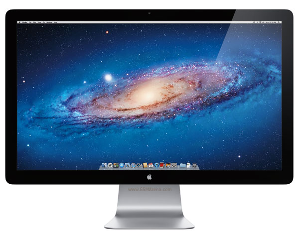
Apple launches new 27-inch Thunderbolt Display


Apple has launched the world’s first Thunderbolt display. This new display is mostly identical to the old 27-inch LED Cinema Display but has a couple of new additions. 


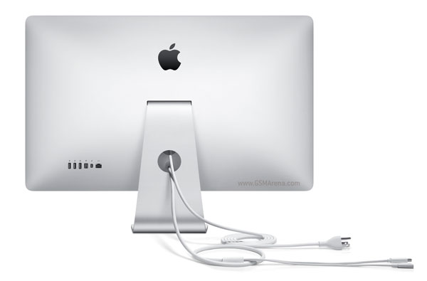
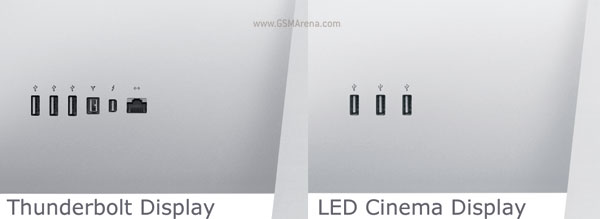
The first one is the most obvious. The new Thunderbolt Display uses a Thunderbolt connector instead of a Mini DisplayPort. The Thunderbolt connectivity takes care of the display, sound as well as data transfer. Due to this the new Thunderbolt Display does not have a separate USB cable unlike the old LED Cinema Display.


The new display also has a FireWire 800 port in addition to the three USB 2.0 ports, as well as another Thunderbolt port so you can daisy chain multiple devices. There is even a Gigabit Ethernet port on the back. Because of all these connectivity options, you can connect everything to the display itself and simply connect the Thunderbolt cable to your MacBook, so when you have to leave and take the MacBook with you all you have to do is unplug a single cable and you are good to go. 


The rest of it is identical to the older Cinema Display. It still has the same glossy 27-inch 2560 x 1440 LED backlit display. There is a FaceTime camera on top which now supports HD recording and built-in 49 watts 2.1 speaker set. The Thunderbolt Display comes with the built-in adjustable stand or you can opt for a wall-mount. 

The Thunderbolt Display costs the same as the LED Cinema Display, which is $999. However, this new model only works with Macs that support the Thunderbolt port. If you have an older Mac, you should consider investing in the older LED Cinema Display instead, which is still on sale. 


Lenovo continues CES invasion with IdeaCentre B-series all-in-ones and refreshed desktops

By:
 
If you thought Lenovo was going to stop its announcements at ultrabooks and netbooks, you obviously don’t know the company very well. The Chinese announcement marathon continued with a bunch of solid desktop computers and refreshed all-in-ones.


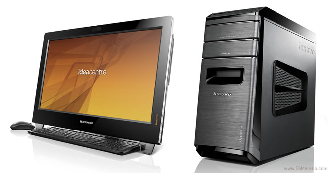
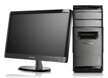
More specifically, the IdeaCentre B-series got a refresh in the form of the B540 and B340 powerful all-in-ones, while the Lenovo desktop family got new members from the IdeaCentre K and H series.

IdeaCentre B540 and B340

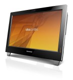
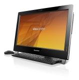
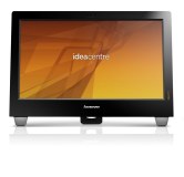
Let’s start with the IdeaCentre B540 and B340 all-in-ones. The B540 will come with a 23-inch full HD display out of the box, while the lower-end B340 sports a 21.5-inch one.Lenovo says the new B-series have an improved multi-touch technology and can be ordered with 3D screens if you want. 


Lenovo IdeaCentre B540 and B340

The company doesn’t get too specific on the processor part, but both machines will have Intel Core CPUs of some kind, up to 8GB of DDR3 RAM, 2TB SATA III hard drives and up to 1GB-packing NVIDIA GeForce 615M graphics card.
Both AIOs can be purchased with the optional OnKey TV4, which is Lenovo’s own way of switching between the PC and TV modes of the computer. There’s also a picture-in-picture mode and the ability to watch just TV without powering the PC on. Expect the refreshed B-series in June with a starting price of $699.

IdeaCentre K430 and Lenovo H520s

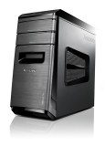
Moving on to the tower desktops we come upon the IdeaCentre K430, which is a real treat if you are loaded enough to spec it to the max. It’s powered by Intel Core i7 CPUs, up to 32GB of DDR3 SDRAM, dual-graphics support by either NVIDIA or AMD, and up to 4TB of HDD configured in RAID 0. 


Lenovo IdeaCentre K430 and H520s


The H520s, unlike its more powerful brother, chooses to provide better value for money instead of ultimate performance. It comes with an Intel Core family CPU, 2GB AMD Radeon HD7570 or a 2GB NVIDIA GeForce GPU and 8GB of DDR3 SDRAM. The maximum storage available is 2TB.
The IdeaCentre K430 will be available in May with a starting price tag of $599, while the H520s will pop up in June for $499.

Source

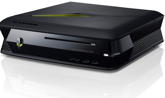
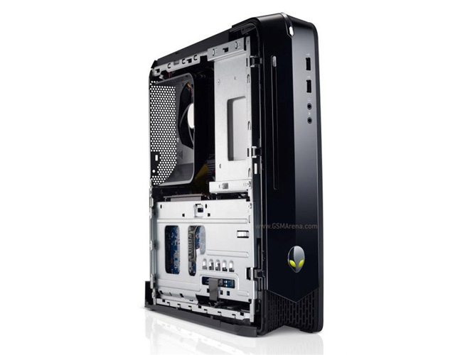
Dell announces Alienware X51, the smallest Alienware gaming desktop ever


The words ‘affordable’ and ‘Alienware’ don’t usually go together but with the new Alienware X51, Dell intends to change that. It is the smallest Alienware desktop gaming system so far and also the cheapest. But despite the starting price of ‘just’ $699, the new Alienware X51 packs in decent hardware. 


For starters you get a 3.3GHz Core i3-2120 processor as standard with the option to upgrade to a Core i5 or i7. You also get a full-size Nvidia GeForce GT545 with 1GB GDDR5 memory with an option to choose the GT555. Then there is 4GB of RAM (option to go for 8GB), 1TB, 7,200-rpm hard drive, slot-loading DVD drive (optional Blu-ray drive), integrated Wi-Fi, 7.1 channel HD audio, six USB 2.0 ports, two USB 3.0 ports, Ethernet and HDMI 1.4. You get a standard 240 watt power supply or an optional 330 watt power supply. 


On the software side, you get Windows 7 Home Premium 64-bit and a host of Alienware software, from the Alienware Command Center that gives you access to all the functions, including the AlienFX lighting effects on the side and AlienFusion power management system. AlienAdrenaline lets you create unique game profiles for launching various customizable events. 

With a starting price of $669, Dell is probably hoping to lure some console gamers over to the PC gaming side. For that price, the Alienware X51 seems like a decent budget gaming system if you’re not the kind of person who likes to build his own system. Don’t forget to factor in the cost of a decent monitor and keyboard/mouse if you are considering buying one. 

Source

Sunday, November 18, 2012

Microsoft Surface review


Microsoft's first own-brand tablet, announced in June 2012 and shipped on 26 October, is the Surface, a 10.6in. device running Windows RT — the Windows 8 version for ARM-based systems. It's a significant bit of kit because it's a showcase for Microsoft's new OS running on the same low-power processor platform as Apple's iPad and the many Android tablets; it's also a departure from x86-based Windows systems (including the upcoming Surface Pro tablet) in that only 'modern-style' (formerly Metro) applications can be installed, and only via the Microsoft-curated Windows Store.

The Wi-Fi-only Surface comes in 32GB and 64GB models, starting at US$499/UK£399; a 32GB model with a black Touch Cover keyboard/cover costs US$599/UK£479, while the 64GB model with a black Touch Cover costs US$699/UK£559. Touch Covers (with a touch keyboard) are available in different colours and cost US$119.99/UK£99.99; the alternative Type Cover, which only comes in black, has a 'proper' keyboard and costs US$119.99/UK£109.99. By comparison, a 32GB Wi-Fi-only iPad 4 costs US$599/UK£479, while the new Google Nexus 10 comes in at US$499/UK£389 for the 32GB model.

Design
 
The Surface is a 10.6in. tablet with a 'dark titanium'-coloured magnesium alloy (VaporMg) chassis measuring 27.46cm (10.81in.) wide by 17.2cm (6.77in.) deep by 0.94cm (0.37in.) thick and weighing 680g (1.5lb). It's not the lightest bigger-screen tablet around, but it feels solidly built, with an angular, chamfered design that looks smart and modern. Going round the system (held in landscape mode): the left-hand side has a volume rocker and a 3.5mm headphone jack; the top has the power/sleep button on the right-hand end; the right-hand side has a Micro-HDMI port, a full-size USB 2.0 port and a magnetic power connector; and the bottom has another magnetic connector, for the optional keyboard/cover units. At the back there's a spring-loaded kick-stand, underneath which lurks a MicroSD card slot, on the right-hand side.
surface-group
The Surface tablet with a black Type Cover attached; also shown is a blue Touch Cover, a pair of Micro-HDMI adapter cables and the AC adapter.
The magnetic keyboard dock attaches to either a Touch Cover or a Type Cover: the former is a flat touch keyboard, while the latter has proper (contiguous) keys and provides a much more satisfactory typing experience. There's a design problem here though, as the kick-stand has only one fairly upright position. That's not a big problem when you're just propping up the tablet — for viewing a movie, for example. However, you'll struggle to find a comfortable typing position for anything more than short bursts of productivity when sitting at a desk or a table — especially if you're of above-average height. Also, it's hard to type with the floppy-hinged, kick-stand-supported device on your lap.
surface-power
The magnetic power connector on the right-hand side is fiddly to locate, and the magnet isn't strong enough to snap it satisfyingly into place.
The other design feature that grates is the magnetic power connector, which is a slim strip on the right-hand side. It's difficult to locate the connector, especially in low light, and the magnet isn't strong enough to snap the power cable into place from any distance (unlike the keyboard connector). We regularly found ourselves having to peer closely at the tablet and cajole the cable into position. While we're on the subject of power, the only available battery life indicator on the 'modern' Start screen is an icon that appears when you activate the Charms by swiping from the right-hand side; to get a percentage figure, and access detailed power management settings, you have to visit the less-than-touch-friendly Windows desktop.

 Features
 
The Windows RT-based Surface runs on an Nvidia Tegra 3 SoC with a 1.3GHz quad-core ARM Coretx-A9 CPU and a 500MHz ULP GeForce GPU. It's backed up with 2GB of RAM and 32GB or 64GB of internal storage (we had the 64GB model). Further storage can be added via the MicroSD card slot on the right-hand side, located somewhat inconveniently under the kick-stand.
The Surface's 10.6in. screen is billed by Microsoft as a 'ClearType HD Display', and it has a 16:9 resolution of 1,366 by 768 pixels. That gives it a pixel density (pixels per inch, or ppi) of just 148, which is less than half that of the Samsung-made Nexus 10's 300ppi. Despite the ppi numbers, we wouldn't say that the Nexus 10's screen is twice as good as the Surface's: with the brightness turned up full, Microsoft's tablet puts on a good display, with wide viewing angles, decent colours and readable type even at small sizes.
Connectivity options are on the sparse side: you get dual-band 802.11a/b/g/n Wi-Fi and Bluetooth 4.0, but no mobile broadband, wired Ethernet, GPS or NFC support (location-based services get their positional data via the tablet's Wi-Fi connection, should it have one). The Surface does have an accelerometer, a gyroscope, a compass and an ambient light sensor.
Microsoft offers a couple of adapter cables for the Mini-HDMI connector on the right-hand side: one ends in a full-size HDMI port and the other caters for older VGA connections. Both of these accessories cost an extra US$39.99/UK£34.99.
The Surface has two 1-megapixel cameras, front and back, both billed as '720p LifeCams'. There's no LED flash, and no fancy photo-stitching camera apps provided as standard (in contrast to Google's impressive Nexus 10). As it stands, Microsoft's basic Camera app simply lets you choose between front and back cameras, set the resolution, apply a 3-second timer and choose between stills or video mode. Perhaps the Windows Store will fill in the gap in due course.
win-rt-start
The Windows RT Start screen, with Charms and the date panel (with wireless and power status icons) exposed by swiping from the right-hand edge.
Windows RT's touch-friendly tile-based 'modern' interface generally works well, although there are some jarring aspects to the overall user experience. The main one is the presence of the old-style Windows desktop (minus the Start button). This is there to run the bundled copy of Office 2013, which is a good thing, but it's likely to cause confusion because you can't install any third-party 'desktop' Windows applications (unlike on x86-based tablets running Windows 8). It also gives Microsoft the excuse to leave vestigial bits of non-touch-optimised interface lying about. We mentioned the battery percentage and power options example earlier: in fact, any time you're forced to use the desktop interface (safely removing a USB stick or accessing Task Manager are other examples), you'll have an experience akin to finding a hand-crank starter on an otherwise sleek and modern-looking automobile.
win-rt-desktop
Lurking in the background of Windows RT is the old-style desktop interface (minus the Start button). You'll have to navigate your way through this less touch-friendly UI to access power management settings, for example. The bundled Office 2013 (Home & Student) applications — Word, Excel, PowerPoint and OneNote (plus a desktop version of IE10) — run here.
Of course, if it's "no Windows desktop, no Office 2013", then we'll put up with the desktop, but it's not clear why the Office suite couldn't have been ported to the modern UI — Microsoft has done it with OneNote, after all. Which brings us to another source of confusion: if you download the (free) modern-UI version of OneNote from the Windows Store, then you'll have two versions of the application on your system; the same goes for Internet Explorer 10, which comes in modern and desktop guises. Incidentally, although Flash is supported in both versions of IE10 for Windows RT, this only applies to Microsoft-approved sites.
So we're left with 'modern' apps from the Windows Store, which as of October 27 2012 had 5,738 — the majority of them (4,634) free. That's a very long way behind the number available for iOS (around 700,000 all told, with 275,000 optimised for the iPad, according to Wikipedia) and Android (around 700,000 in total, although only a small [unknown] proportion are optimised for larger-screen tablets). It's not just raw numbers, of course: if your favourite app isn't in the Windows Store (for us, Spotify looms large), then you're going to think twice about investing in the platform.
Although the Surface is primarily a consumer device, the presence of Office 2013 and the keyboard options means you can do real work on it if need be. However, it's the Home & Student version of Office, which doesn't include Outlook and comes with licence restrictions that may reduce its appeal to small businesses. Larger enterprises are likely to choose devices running the full x86 version of Windows 8 (if they choose Windows 8 at all) for its ability to run legacy desktop applications and greater manageability.

Performance & battery life
 
In the absence of cross-platform benchmarks for comparing Windows RT to iOS and Android devices, we're left with browser benchmarks to give some indication of comparative performance. The picture is mixed, with the Surface showing up well in the Sunspider JavaScript test, but lagging behind its rivals in Rightware's broader-based BrowserMark and Microsoft's Fishbowl HTML5 test:
surface-sunspider
surface-browsermark
surface-fishbowl
Microsoft claims 'up to 8 hours' life for the Surface's 31.5Wh battery, which suggests an average power draw of around 4 watts. To test this we used a Voltcraft VC940 Plus multimeter to measure the tablet's power draw when idling at the Start screen and performing a workload (the Fishbowl test, above), with the screen at 100 percent and 50 percent brightness. Dividing the average power draw into the 31.5Wh battery rating gives the expected battery life in hours for each scenario:
surface-battery-life
These results suggest that if the tablet is working rather than idling, and you're using a high screen brightness setting, you can expect around four hours' life on battery power.


Wednesday, November 14, 2012

Nexus 4 Review

By

Nexus 4 review
Movie sequels often don't live up to the hype of the original blockbuster, but the same isn't always true of smartphones -- on the contrary, they typically get even better. The Nexus lineup, initially thought of as a "playground" for Android developers to test their apps on, has continually gotten better at its craft (and popularity). Not only that, it's picking up momentum: in less than five months, Google has crafted two Nexus tablets as well as its latest and greatest smartphone known as the Nexus 4, and the attractively priced devices are now facing more interest than they ever have before.

The Nexus 4 is a veritable dreamboat when it comes to looks and specs. It's a smooth, elegant-looking device that comes with a large, 4.7-inch, HD display, a 1.5GHz quad-core Snapdragon S4 Pro processor and plenty of other appealing components. It exhibits a lot of commonalities to LG's current flagship, the Optimus G. And for a starting price of $299 unlocked, it's sure to attract a whole new demographic that until recently had never even heard of a Nexus. But is this a flagship smartphone that everyone will want to buy, or should the fourth-generation offering just be another target of developers' envy? Stay tuned past the break to find out.
Hardware

The Nexus line has always been a solid indicator of the state of the smartphone industry. While these phones aren't guaranteed to have the absolute best components available, they're still highly competitive and, in recent times, have offered some of the best value, dollar for dollar. This leaves us even more impressed, then, that the LG-made Nexus 4 has been endowed with state-of-the-art silicon and is backed up by some of the best components on the market.
The Nexus 4 is one of the most elegant devices we've played with.
Once it's available, Google's newest Android smartphone flagship will be one of the most exquisite devices you can buy. In many respects, it's the lovechild of a Samsung Galaxy Nexus and an LG Optimus G: it features the sleek curves of its predecessor along the edges, along with a unibody back cover and scratch-resistant glass. At 4.9 ounces (139g) and 0.36 inches (9.1mm), it's slightly lighter and thicker than the Optimus G (5.2 ounces and 0.33 inches, respectively), but the difference in these two areas doesn't make it any more or less comfortable -- what does help your hand-holding experience, however, is the tapered edge that adds an extra place for your fingers to naturally rest.
DNP Google Nexus 4 review
You may be wondering why we've talked so much about the Optimus G already, and it's because it shares many commonalities with the Nexus 4; both use a 1.5GHz quad-core Snapdragon S4 Pro chipset, 2GB RAM and sport the same 4.7-inch True HD IPS PLUS with 1,280 x 768 resolution. They even pack the same 2,100mAh battery. Indeed, a close look at the two devices side by side should be enough to convince someone that the two are blood brothers, perhaps even fraternal twins. If it weren't for the Nexus 4's gentle curves, we'd wager they were born of the same chassis. Keep in mind that this isn't a harsh comparison: we were quite fond of the build quality and materials used in LG's top-of-the-line smartphone, and having a similarly specced device with comparable build and a vanilla version of Android 4.2 sounds like a killer combination.

Gracing the front of the phone is the IPS PLUS display mentioned earlier, dressed with a full slab of Gorilla Glass 2. The glass itself curves down a bit as it meets the left and right edges, which certainly adds to the feeling of elegance. The idea here is actually to add more of a natural feel when swiping back and forth on the screen. (HTC did something similar with the One X.) Our only complaint with this is that it's easy for dust and other tiny particles to get stuck between it and the chrome lining the edge. Continuing on, there's a 1.3-megapixel front-facing video cam on the top right and sensors on the top left. Below the screen sits the pulse notification light, which brought back memories of what's found on the Galaxy Nexus, and there are no capacitive buttons since LG added virtual navigation keys to the screen.
DNP Google Nexus 4 review
The left side houses a volume rocker, while a secondary mic and headphone jack sit up top. Moving over to the right, you'll see the power button just barely above where your index finger naturally rests -- this is nice because you won't accidentally bump it every other second, but it's still within easy reach. The bottom is where you'll find the micro-USB / Slimport socket.

Let's talk a little about that last one: Slimport. It appears that Google and LG have chosen to use Slimport for tethered display sharing, rather than standard MHL. Neither company has shared the reasoning behind this decision, but whatever it is, you'll need to buy a special adapter if you want to take advantage of this capability. It's not the only way to mirror your phone's display on your TV -- Android 4.2 has now added native support for Miracast's wireless display standard -- but if you don't have equipment compatible with Miracast, Analogix's $30 Slimport adapter is a cheaper alternative to purchasing Miracast-certified gear.
DNP Google Nexus 4 review
Moving on to the back, we already mentioned briefly that it's covered by scratch-resistant glass. It's not a removable cover, which means you won't be getting access to your battery unless you're willing to be adventurous and start removing screws. On the top left you'll see the 8MP rear camera and LED flash aligned vertically, with the famous Nexus logo sitting just below. LG added its own stamp to the bottom of the back, right next to a speaker grille on the right side. But the most interesting part of the whole thing is its checkerboard-like decor that looks like a cross between "The Matrix" and the iconic tile-like live wallpaper made famous by the Nexus One. When we first saw the device in leaked photos, we worried that it might look too tacky -- on the contrary, it not only adds to the subtle aesthetics, but it helps the Nexus 4 stand apart from all those other bland, rectangular phones.
You'll probably want to avoid concrete at all costs.
With all of our praise about the phone's design and build, there is one potential hazard: that glass-laden back. We haven't had any terrible luck in that department yet, but it's worth noting that this part of your phone -- while sleek and gorgeous -- should probably avoid the concrete at all costs.

Now, onto the portion of the review that you'll either love or hate, depending on where you live and what network you use. The Nexus 4, like the Galaxy Nexus before it, is a penta-band (850/900/1700/1900/2100) HSPA+ device, but this one goes up a step by offering 42Mbps speeds. It's also quad-band (850/900/1800/1900) GSM / EDGE, which means this phone will work with virtually every GSM and HSPA carrier in the world. Unfortunately, the one thing truly missing from the Nexus is LTE compatibility. In many parts of the world, this won't be an issue; people using a carrier with LTE service may feel frustrated, however. We'd love to see a special edition come out down the road, but we're not going to hold our breath for it.
Finally, the Nexus 4 also fully supports the Qi wireless charging standard, which means you can use any Qi-capable charging pad to refill your battery -- we even took it for a spin on the Fatboy recharging pillow sold by Nokia, and it worked like a charm.

So what else does this beauty have, and how does it compare with last year's model? Check out the table below for all the details.
Nexus 4 LG Optimus G (Korean version) Samsung Galaxy Nexus (HSPA+ version)
Dimensions 5.27 x 2.7 x 0.36 inches (133.9 x 68.7 x 9.1mm) 5.19 x 2.71 x 0.33 inches (131.9 x 68.9 x 8.5mm) 5.33 x 2.67 x 0.35 inches (135.5 x 67.9 x 8.9mm)
Weight 4.9 oz. (139g) 5.11 oz. (145g) 4.76 oz. (135g)
Screen size 4.7 inches 4.7 inches 4.65 inches
Screen resolution 1,280 x 768 pixels (320ppi) 1,280 x 768 pixels (320ppi) 1,280 x 720 pixels (316ppi)
Screen type True HD IPS Plus True HD IPS Plus Super AMOLED HD (PenTile)
Battery 2,100mAh 2,100mAh 1,750mAh
Internal storage 8 or 16GB 32GB 16GB
External storage No microSD slot No microSD slot No microSD
Rear camera 8MP, AF, LED flash 13MP, AF, LED flash 5MP, AF, LED flash
Front-facing cam 1.3MP 1.3MP 1.3MP
Video capture 1080p 1080p 1080p
NFC Yes Yes Yes
Radios HSPA+ 42 / UMTS: 850/900/1700/1900/2100; GSM / EDGE: 850/900/1800/1900 GSM / GPRS 850/900/1800/1900; UMTS/HSPA+ 900/2100; LTE band 3 HSPA+ 21 / UMTS: 850/900/1700/1900/2100; GSM / EDGE 850/900/1800/1900
Bluetooth v4.0 v4.0 v3.0
SoC Qualcomm APQ8064 Snapdragon S4 Pro Qualcomm APQ8064 Snapdragon S4 Pro TI OMAP 4460
CPU 1.5GHz quad-core 1.5GHz quad-core 1.2GHz dual-core
GPU Adreno 320 Adreno 320 PowerVR SGX540
RAM 2GB 2GB 1GB
HDMI options Slimport (wired) / Miracast (wireless) MHL (wired) / Miracast (wireless) MHL
WiFi 802.11 b/g/n dual-band 802.11 a/b/g/n 802.11 a/b/g/n dual-band
Operating system Android 4.2 Jelly Bean Android 4.0.4 ICS Android 4.1 Jelly Bean
Display

DNP Google Nexus 4 review
A quick review of the above spec list should indicate that the display is essentially identical to the one used on the recently released LG Optimus G, the Nexus 4's close sibling. Looking backward, it's also better than the HD panel the Galaxy Nexus bears. What we're looking at (literally) is a 4.7-inch, 1,280 x 768 True HD IPS PLUS display, with a sheet of Gorilla Glass 2 covering it. With the Nexus 4, however, the Corning-furnished glass plays a much more critical role than it does on other smartphones. LG has developed a technology that integrates the display's touch sensor into the outer layer of the glass. This not only makes for a thinner phone, it brings the pixels closer to the display itself. (If this sounds familiar, it's because Apple has done something similar to this with the iPhone 5 and Microsoft's Surface for Windows RT.)
The display is among the best that you can currently find on a smartphone.
Additionally, its WXGA resolution translates into a pixel density of 320ppi, but its RGB subpixel arrangement means it actually packs more of a visual punch than the PenTile Super AMOLED HD screen on last year's Nexus. There's less pixelation -- if that's even possible -- and the viewing angles are fantastic, providing us better opportunities to read articles and watch movies than most other devices we've used. Also, it's one of the nicest displays we've ever viewed in the midday sun. We could see everything clearly at right around 50 percent brightness, and it was still at least relatively easy to read with the settings down to about 30 percent.

This panel is one of the best you can get right now, and is on par with the 720p displays we've played with on the One X and Samsung Galaxy S III. It ranks in between those two competitors when it comes to color saturation. The darks are as dark as you'll see on the One X (but less than the GS3), and the whites are brighter than on either rival phone. We also noticed that the Nexus shows off the darkest reds and magentas, as well as the lightest greens and yellows. As a result, your viewing experience may differ slightly from other 720p displays, but we've been very pleased with what we've seen on the Nexus 4.
Android 4.2
DNP Google Nexus 4 review
Aside from the inaugural Nexus (the HTC-made Nexus One), each subsequent version of the Nexus has ushered in a new era of Android firmware along with it -- Gingerbread for the Nexus S, Honeycomb for the Motorola Xoom, ICS on the Galaxy Nexus and Jelly Bean on the Nexus 7. And as we've come to expect from this precedent, the Nexus 4 comes loaded with Android 4.2. But there's something drastically different this time around: despite the new version number, this upgrade is still considered Jelly Bean. This is the first time we've seen such a move since Eclair was bumped up from 2.0 to 2.1.

An incremental ".X" update without a new dessert-themed codename typically indicates a small refresh with just a few enhancements. We think there's enough of a change to justify jumping up to a treat that begins with "K," but most of the significant design shifts have to do with the tablet experience; in contrast, there have been few drastic changes on the phone side. We wonder if many of the features added to the Nexus 4 and Nexus 10 were already on the drawing board alongside the rest of Jelly Bean and just weren't ready in time, but none of that really matters. What's important is that we have some new things to enjoy at the present time. Here's what you can expect to see in Jelly Bean, part deux.
Android 4.2 may still be Jelly Bean, but it still brings plenty of useful improvements.
First, we mentioned briefly that you'll see a larger difference on the tablet side than on the phone. This is because the Nexus 10 sheds both the settings box in the lower-right corner and app menu access in the top right. Instead, it offers two pull-down menus on the top: the left side acts as your standard notifications menu, while the right side features the new Quick Settings menu (more on that shortly). It also uses the standard set of three virtual navigation buttons that you'll find on the Nexus 7 and Galaxy Nexus.
Lastly, Android 4.2 also brings multi-user capabilities to the tablet, in which different members of the family can have their own private set of apps, settings and files -- in other words, the same experience you can have on a standard PC or Mac. Unfortunately, this isn't available for smartphones, so the Nexus 4 doesn't get to take advantage of this. (We have a hunch this feature may be added to phones at some point, but we have no inside information to confirm this.)

Let's dive into the improvements that you can take advantage of on the Nexus 4. The Quick Settings menu is exactly what it sounds like -- a panel full of access points such as brightness, WiFi, battery life, airplane mode, Bluetooth and data usage. It also includes a direct link into the settings menu. The concept is incredibly similar to what you would find on a TouchWiz or LG device (amongst other custom skins), but it uses up its very own space rather than co-habitating on the same menu as the notifications. Fortunately, it's just as easy to get to: pull down from the status bar with two fingers instead of one, and presto -- you're in. It can be accessed from the Lock Screen and the notifications menu as well. Sound familiar? If so, it's likely because you can find a very similar concept in Motorola's latest series of devices, such as the RAZR M and RAZR HD. Given Moto's new role, it sure seems like a very interesting coincidence, doesn't it?
DNP Google Nexus 4 review
The new and improved Jelly Bean also features native widget support on the Lock Screen and even offers multiple panels for additional widgets. Our units didn't come with the feature, as it likely won't be available until the Nexus devices start shipping out, but this may very well be one of our favorite additions to Android. We love the idea of being able to view emails, calendar appointments and other notifications without entering the home panel -- it may sound like we're too lazy to take an extra step and unlock the screen to see our widgets, but the ability to quickly glance at crucial information without entering your phone should not be underestimated.

You can expect to see more cards popping up in Google Now. The service has been given more powers, such as the ability to find local events and concerts, nearby attractions and Photo Spots (places for photo opps). The card for Photo Spots shows a grid of thumbnails, each of which can be clicked for a larger picture, details and directions. There's a whole new series of cards that digs into your Gmail inbox and finds relevant information: when you get a flight or hotel confirmation email, Now will automatically pick it up and remind you about it. The same goes for packages, event bookings and restaurants.
DNP Google Nexus 4 review
Voice search, which we used with mixed results in 4.1, has been bestowed with an improved set of queries. You're now able to schedule meetings, check to see your next appointment and launch apps ("open app [name of app]" will do the trick). Google also says that when you ask questions that may not have a definitive answer, the service will do a comprehensive search for your inquiry, see what the general consensus is and provide you with an answer based on what it found. Additionally, we found that it was able to pull up more information than before. For instance, we asked what year "Back to the Future" came out, and were given the specific release date as well as a card with information about the movie. Indeed, Google's made a decent amount of effort to make the voice search experience more of a natural interaction, rather than let it feel like a machine dictating search results.

By the way, Jelly Bean users don't have to wait for the Android 4.2 update to come out to enjoy a lot of the same things -- most of these new features in Now are now available for Android 4.1 users, thanks to an update to the Google Search app in the Play Store.
Typing with swipe gestures is now natively supported in Android 4.2.
Google has also thrown in "Gesture Typing" to the stock keyboard which makes it much easier -- and appealing -- to use. Taking a page out of Swype's book (and, perhaps, some of the wind out of its sails), 4.2 now lets you swipe from one letter to another, rather than using the traditional hunt-and-peck method of typing. It's incredibly accurate, too, as the keyboard rarely had a hard time understanding what we were trying to type. It's even capable of predicting which word you're attempting to type via the swipe gesture. As you start spelling your word, a box will appear next to your finger with a word prediction. If you lift your hand off the screen, that predicted word will pop right into place and you can continue with the rest of your message. The experience is now much more intuitive and enjoyable to use.

Gmail also received a small facelift, now boasting pinch-to-zoom and automatic formatting so the entire message can fit on the screen. You can also swipe left or right on a message in your inbox to quickly archive it.

Next, you can magnify whatever is on the screen by triple-tapping it. From there you can pan around by using two fingers or even pinch-to-zoom to adjust the amount of magnification viewed on the display.
Google Nexus 4 review
The Daydreams feature is also new to the stock Android experience. This is the smartphone equivalent of screen savers. It displays content on your screen when the phone is docked or charging. You can view a selection of images as they float around, check out the latest feeds coming through Currents or even burn time by flicking around jelly beans. (Unfortunately you won't find any flying toasters. Yet.) It adds very little in the way of functionality, but it's a clever trick if you aren't using your handset and want to have something to peek at while it sits on the coffee table.
Daydreams is basically a glorified screen saver.
We briefly mentioned earlier that Miracast is now natively supported in Android 4.2, which means you'll now be able to wirelessly stream movies and music from your phone to the TV or other Miracast-certified device. Here comes the tricky part: if your TV or monitor isn't certified for the standard, you'll need to make sure you grab a Miracast adapter, which isn't super cheap -- a brief Amazon search brings up one result that costs $70. Still, if you can find one or if you already have equipment capable of picking it up, you'll at least have one more solid reason to pick up a Nexus 4.
Camera
DNP Google Nexus 4 review
We'll admit that we always hold Nexus devices up to the highest of expectations -- each one carries the burden of being the latest Android flagship, and they're held up by Google as an example for other Android manufacturers. That's why we were extremely disappointed in Samsung's decision last year to include a paltry 5-megapixel sensor in the Galaxy Nexus. A year later, LG made sure to stick an 8-megapixel camera into the Nexus 4. On the spec sheet, it's not the best in the market -- but remember, megapixel count never tells the full story.

Before we get too far ahead of ourselves, though, let's discuss the user interface in the camera app. Even if you've used Android devices in the past, the Nexus 4's UI might throw you for a loop at first. It's very basic at first glance, consisting only of a viewfinder and a sidebar with a shutter button, settings button and a toggle for camera modes. When you choose settings (which can also be selected by long-pressing the viewfinder), you'll be shown a large circle with various choices lining its outside. Just drag your finger up to each one and you'll be shown more options; you can also pinch-to-zoom up to 4x on the viewfinder. You may also be thrown by the lack of a gallery thumbnail, but don't panic -- just swipe to the left and your gallery will show up, a gesture similar to iOS or Windows Phone, which allows you to swipe to the right for the same result. Exposure and focus lock are also available by tapping and holding the screen.

We wish we could say the Nexus 4's camera was decked out with all of the trimmings (think of the list of settings you get on a Galaxy S III), but the selection is pretty limited here: HDR is now natively supported, and you can also adjust white balance, select one of four scene modes and change the resolution and flash setting. Panorama mode makes a return appearance as well. Yep, that's about it. If you crave any other clever filters for your Nexus, you'll want to start checking out what options are available in the Play Store -- fortunately, there are plenty to choose from.
DNP Google Nexus 4 review
There is one other neat camera mode you can take advantage of with Android 4.2, and that's Photo Sphere. You could call it a type of "Panoramic Mode 2.0" -- instead of simply snapping images horizontally, you can add another dimension by going vertically as well. Then, after a minute or two of stitching, your picture is ready for viewing and it shows up with a natural sphere-like curvature; when looking at the finished product, you get a sense that you're actually looking from left to right as if you're really there -- often, you'll need to scroll around the entire image in order to see the whole thing, which adds a stunning amount of depth to our pictures of scenic vistas. And, for an even nicer touch, the phone is capable of doing the scrolling for you so you can just sit back and enjoy the scenery. There's only one concern: we noticed that the phone had some problems stitching photos together. In one shot, the right half of a window was noticeably higher (and had more reasonable exposure) than the left half, a picture frame looked as if it had been sawed in half and one side of the bookshelf had far more exposure than the other. This issue is more with the firmware itself, most likely, as we noticed similar problems on the Samsung-crafted Nexus 10. We hope to see this resolved in a future 4.2.x update.

Now let's turn our attention away from the software and dig into the performance of the camera itself. As we mentioned before, the last Nexus wasn't exactly what we would call a stunner in the imagery department, so would this year's model be any different? The quick answer is yes -- and in a good way.
We did some comparison tests with the Nexus 4 and the Galaxy S III, one of the best 8-megapixel mobile cameras we've had the pleasure of using. There are a few areas in which the Nexus 4 bests the GS3, and others in which it's still very good, but loses to its Samsung competitor. The Nexus appears to be slightly better in close-ups and when zooming in at full strength. We also prefer HDR on the Nexus. Colors, however, seem to be more naturally saturated on the GS3 and the sky shows a more realistic blue hue.

The LED flash on the Nexus 4 is bright -- in fact, it's almost too bright. This is a rare problem to have on a smartphone, no doubt, but many of our shots taken with the flash on end up washing some of the color out. The GS3's flash, by comparison, is softer, but at least we were able to see all of the colors the way they're supposed to look. In general, low-light performance was acceptable on the Nexus, but we noticed more noise and less light than on the GS3.
The camera is much improved over what we saw on the Galaxy Nexus.
Lastly, the shutter speed seems to vary, depending on if it needs to focus before the shot is taken, but it still comes in under less than two seconds most of the time. There were a few occasions in which our subjects came out blurry because they moved before we could finish taking the shot.
Overall, it may not be the best performer among its peers, but the camera is still an asset to the Nexus 4, whereas it was a detriment to the phone's predecessor. And that's exactly what we were hoping to see. While we always prefer to have the best possible performance -- we're just picky that way -- it's nice to at least see more love and attention being paid to this aspect of the Nexus lineup.

The camcorder is capable of taking 1080p movies in MPEG-4 format, and records footage at an average of 22 fps with a 9 Mbps bit rate. This resulted in noisy, slightly choppy videos that didn't really convince us that what we were watching was of true HD quality. One positive takeaway is that you're still able to take images as the same time you record video, much like you could on the Galaxy Nexus.
Performance and battery life

DNP Google Nexus 4 review
The performance of the Nexus 4 is a curious thing. The phone has a complete beast of a chipset running things behind the scenes: it's the same 1.5GHz quad-core Snapdragon S4 Pro (APQ8064) as we saw in the LG Optimus G, paired with an Adreno 320 GPU and 2GB of RAM. In our initial tests between the aforementioned LG flagship and the Samsung Galaxy Note II (which sports a 1.6GHz quad-core Exynos chip), the S4 Pro comes out on top. And in our real-world use tests, we were overall satisfied with the zippiness of the Nexus. For the most part, it was responsive and fast, multitasking was smooth and we only rarely had any lag. In side-by-side use, it does feel slightly slower than the Optimus G; most of the time this difference is rather infinitesimal, but there are a few times that it stuck out like a sore thumb. For instance, we noticed that when dialing a phone number -- a rather trivial task in the OS -- we'd have to wait for the numbers to catch up with us, whereas the Optimus G passed this simple test with flying colors. (Update: we found that the phone dialer issue is much more noticeable when the triple-tap magnification feature is turned on. This can be disabled in accessibility settings.)

There are two strange things at play here. First, we fully expected the phone to be even faster than the Optimus G, mainly because LG and Google have had the opportunity to make sure Android 4.2 is fully optimized with the manufacturer's hardware, and the lack of custom skin should theoretically keep everything running efficiently. The second concern is in the benchmarks we ran.
Google Nexus 4 LG Optimus G Samsung Galaxy Note II
Quadrant (v2) 4,902 7,628 6,819
Vellamo (v2.0 HTML5) 1,236 1,710 2,482
AnTuTu 10,122 11,284 13,539
SunSpider 0.9.1 (ms) 1,975 1,283 1,023
GLBenchmark 2.5 Egypt 1080p Offscreen (fps) 30 31 17
CF-Bench 13,835 14,398 15,267
SunSpider: lower scores are better
Before we dive in, we'll get one thing out of the way: benchmarks don't always tell the full story, and we understand that they often don't replicate real-world usage. But this is one of those cases in which it's helpful to have a quantitative measurement after running the same kinds of tests. Since the Nexus 4 and the Optimus G are so similar in their chipsets and other components, the two's metrics should be easily comparable -- or at least in the same neighborhood as each other. But as you can see in the table above, some of the numbers are the complete opposite of what we expected. In fact, some of these results (most notably, Quadrant and Vellamo) are even lower than what we typically get out of dual-core Snapdragon S4 processors. To be fair, CF-Bench and GLBench didn't veer as far away from our expectations, and were quite respectable.
We would be tempted to shrug it off and choose not to give this concern much thought, but we also ran into the same exact problem with another Nexus 4 review unit and multiple Nexus 10 devices as well. It's also easy to blame the benchmarks for not being optimized on Android 4.2, but we've never seen these tests exhibit this same problem with other versions of the mobile OS when they were brand new. That said, our units may very well have been loaded with a non-final firmware build that could be contributing to our dilemma somewhat. We'll receive a final pre-launch update that will enable lock screen widgets, so we're keeping our fingers crossed that a few more optimizations are included. (We'll update our review if we notice any uptick in performance or test results.) Still, you're going to get a pretty nice bang for your buck, and we doubt most power users will come away disappointed.
Performance is pretty solid, though it comes with the occasional hiccup.
We ran Riptide through its paces and it didn't skip a beat; the graphics were fantastic and we didn't have any problem. When we played Need for Speed: Most Wanted, an even more graphically intensive game, we saw a few frame skips and stutters throughout each level we played. These issues didn't interrupt the flow of the game, but they were still noticeable. Aside from these hiccups everything worked well, as there weren't any problems in rendering all of the details, such as the reflections cast onto the car and the fine quality in the surrounding buildings and other landmarks within the game.

Battery life is yet another segment of the performance that's confused us. Since the Nexus 4 uses the same 2,100mAh battery (and power-friendly Krait chip) as the Optimus G, we expected to record essentially the same runtime. Much to our surprise, however, it was considerably worse in both our tests and our real-life use. Our standard video rundown test, which consists of looping a movie at 50 percent brightness with WiFi on (but not connected) and normal pull notifications for email and social media, lasted for five hours and 18 minutes before the battery died. Our anecdotal tests -- in which we do a moderate amount of email, social media, messaging, web surfing and take a few pictures and make some phone calls -- almost got us a full day of use, but your overall result will definitely depend on how bright you set that display. Regardless, the experience we had with both of our review units is still a stark contrast to the Optimus G, which lasted over eight hours in the video rundown test and 20 hours with moderate use.

We loved making calls on the Nexus, as our friends came through loud and clear. It was static-free and neither side of the conversation had any difficulty hearing each other.

It's at this point that the plot continues to thicken. While we were satisfied with how loud and crisp our calls were, the external speaker was a completely different story. With both voice calls and music playback, it was substantially softer than on most comparable phones we've tested recently, and on several occasions we found ourselves double-checking the settings to make sure we had it as loud as it could possibly go. Additionally, the external speaker grille is flush with the phone's back, which causes the sound to be extraordinarily muffled when you rest the phone on a flat surface with the display facing up. We also tested the Nexus 4 with Klipsch Image S4A in-ear reference headphones and found the volume to be adequate, but it's definitely not the loudest we've heard. On the flip side, we didn't have any concerns with its clarity or being able to hear the highs, mids and lows. Speaking of multimedia, we should also mention that the display and chipset contributed to a flawless movie-watching experience.
Pricing and availability

DNP Google Nexus 4 review

The LG-made Nexus 4 will be available as an unlocked device in the Play Store beginning November 13, and it will come in two flavors: 8GB for $299 and 16GB for $349. We're not looking to sound like Crazy Eddie when we say this, but it's hard to dispute. This is an incredible price for a brand new quad-core HD device, especially when the least expensive phone on the market with similar specs will be the Huawei Ascend D1 Quad XL at $450 (and that's not even available in most major markets). It'll be on sale in the US, UK, Canada, Germany, France, Spain and Australia to start off with, but because it's penta-band, you'll easily be able to stick in a micro-SIM card from virtually any GSM carrier in the world and roam at your leisure.

Stateside Nexus fans will have one other option: buy the 16GB model for $199 on T-Mobile with a two-year contract, starting November 14th. (It's also offered at the same price on the company's Value Plan.) We have a difficult time recommending this particular route -- you save $150 up front, but you're locked into a plan for two years and may likely pay more on a monthly basis as a result. There's no other differentiation between the two: no branding, no bloatware or special apps. WiFi calling isn't supported, and both versions are confirmed to include DC-HSPA+ 42Mbps speeds.
Wrap-up

DNP Google Nexus 4 review

The idea that a Nexus quad-core smartphone is hitting the market with a starting price one dollar shy of $300 is simply stunning. Even more so is that it's available without any contract or carrier locks, which means you can use it virtually anywhere in the world. Adding yet another layer of amazement is the fact that this particular device will always be among the first (if not the first) to get the latest version of Android for the foreseeable future. What once was a smartphone series designed for developers has been decked out with top-notch features and priced so attractively that consumers will take notice of it; there's nothing comparable that comes close to it in that price range. This is a smartphone that we'd normally expect to be much more expensive unlocked, but Google set a precedent by lowering the cost of the Galaxy Nexus, keeping the Nexus 7 at $200 and is now continuing the trend with the Nexus 4. The price of freedom has never been more reasonable.

Sure, the Nexus 4 is not without its hiccups, but none of its predecessors have been perfect, either. And given the boost in real-world performance, the better camera and various other new features, it's even more tempting than all those previous devices whose shoes it's trying to fill. In a case like this... you have our permission not to resist.